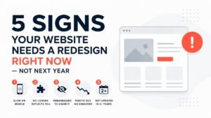
5 signs your website needs a redesign right now — not next year
A bad website doesn't announce itself. It just quietly sends potential customers somewhere else. Here the 5 signs your redesign website strategy needs to start exactly here.
Most business owners don't know their website is losing them clients. The site is live, it loads, it looks roughly how they remember it — and so it stays untouched for years. Meanwhile, it quietly turns away the exact people they're trying to reach.
The last time you really looked at your website — not just glanced at it, but went through it the way a new visitor would — when was that? If you can't remember, there's a decent chance it's no longer doing what you need it to do.
Here are the five signs that come up most consistently when we audit a site that's underperforming. If more than two of these apply to you, it's worth taking seriously.
"The danger isn't a website that looks broken. It's one that looks fine — but silently costs you clients every single week."
It loads slowly — especially on mobile
Older websites are disproportionately affected by this. They were often built without mobile performance in mind, carry uncompressed images from years ago, and run on hosting that no longer meets modern standards. The result is a site that feels noticeably sluggish on a smartphone — which is where most of your potential customers are searching from.
The speed problem compounds. Google now uses Core Web Vitals — which include load speed — as a ranking signal. A slow site doesn't just frustrate visitors; it also ranks lower in search results, meaning fewer people find you in the first place. You get hit twice.
Go to pagespeed.web.dev and enter your URL. It takes 30 seconds and gives you a score out of 100 separately for desktop and mobile. Anything under 70 on mobile is a problem worth fixing. Under 50 is urgent. Our free website audit checklist walks through what to check and what the numbers mean.
It no longer reflects who your business actually is
Your services have evolved. Your pricing has shifted. The clients you want to work with now are different from the ones you were targeting two years ago. But your website still describes the version of your business that existed when it was built.
This is one of the most common and most overlooked — problems we see. Businesses grow and change quickly, but websites get updated slowly if at all. The gap between what the site says and what the business actually offers creates a subtle but damaging sense of inconsistency. Visitors sense it even when they can't name it. It reads as a business that isn't quite sure what it is.
It also creates practical problems. If your service page still lists an offering you no longer provide, or describes a client type you've moved away from, you'll get enquiries from the wrong people and have awkward conversations explaining why you can't help them the way they expected.
Read your homepage headline cold as a complete stranger would. Does it describe exactly what you offer today, who it's for, and what makes you different? If you find yourself thinking "well, that's not quite right anymore" — it isn't.
You're embarrassed to share it
This one doesn't need a stat or a technical explanation. You know it's true when you feel it.
When someone asks for your website and you hesitate before giving it. When you're in a proposal and you quietly hope they don't look you up until after you've had a chance to explain yourself. When you add a mental asterisk — "it's a bit outdated, I'm working on it" — before sharing your URL.
That hesitation is important information. Your website is supposed to be the first impression you make on people who don't know you yet. If you, the person who built the business, wouldn't confidently send someone there — why would a prospect feel confident reaching out through it?
A website you're proud to share doesn't mean an expensive one or a flashy one. It means one that accurately represents the standard of your work, answers the right questions, and gives people a reason to trust you. If yours doesn't do that, it's working against you every time someone looks you up.
You're getting traffic but no enquiries
Google Analytics shows visitors. Your inbox shows silence. This combination is one of the most frustrating situations a small business owner can be in — because you're doing the work to get found, but something is stopping people from taking the next step.
This is almost always a conversion problem, not a traffic problem. It means people are landing on your site and leaving without enquiring — not because they aren't interested, but because something on the site fails to bridge the gap between "I found this" and "I want to reach out."
The most common causes are consistent: messaging that doesn't speak directly to the visitor's problem, a call to action that's buried or nonexistent, and a lack of trust signals — no testimonials, no faces, no evidence that you've solved this problem for someone like them before. We covered exactly why this happens in detail in our post on why most small business websites lose leads.
Check your homepage bounce rate in Google Analytics. If it's above 70%, most visitors are leaving after seeing just one page. Then check: is there a clear call to action visible without scrolling? Is there at least one testimonial on the homepage? Is your headline specific enough that a stranger immediately understands what you do?
It hasn't been properly updated in more than two years
Two years is a long time on the internet. It doesn't feel that way — your site still exists, still loads, still looks broadly the same as you remember it. But the standards it's being judged against have moved significantly.
Since 2022, Google has rolled out multiple core algorithm updates that changed how sites are ranked for quality and helpfulness. Mobile usage has continued to grow, pushing the bar higher for responsive design. Core Web Vitals became a confirmed ranking factor. Security requirements have tightened. Design expectations — what looks current versus what looks outdated to a first-time visitor — have shifted noticeably.
None of this means your site is broken. But a site built in 2022 and left untouched in 2025 is a site that has been slowly falling behind without anyone noticing. The copyright year in the footer says it clearly. So does the design language, the font choices, the image treatment.
When did someone last do a proper review of your site — not just a content update, but a technical audit, a speed test, a mobile check, and a look at whether the messaging still fits? If the answer is "never" or "I don't remember," that's the answer.
Does this mean you need a full rebuild? Not necessarily.
Reading through five signs that something is wrong doesn't mean the answer is automatically starting from scratch. A complete rebuild makes sense in some situations — but in others, a targeted refresh delivers most of the benefit at a fraction of the cost and time.
The difference usually comes down to how many of these signs apply and how severe each one is. Here's a rough guide:
- Content is mostly right, just needs updating
- Structure works, execution is dated
- Speed issues that are fixable without rebuilding
- One or two conversion problems to address
- Core brand is solid, just visually stale
- Business has changed significantly since the site was built
- Platform is outdated and can't support what you need
- Structural problems that can't be patched around
- Three or more of the five signs above apply
- The site has never converted well, even when new
The fastest way to know which camp you're in is an audit — a proper look at what's there, what's working, and what isn't. We do these for free. You can see what one looks like in our case study of a client who went from 200 to 650+ monthly visitors after we identified the specific issues holding them back.
Let's find out — for free
Start with our 25-point audit checklist to see what your site is missing. Or book a free audit call and we'll go through it properly — no pitch, just honest feedback on what to fix first.